Ainu Sapporo Upopo Hozonkai
Web redesign for a traditional Ainu performance group based in Sapporo, Japan
Overview
Sapporo Upopo Hozonkai is a traditional Ainu performance group based in Sapporo, Japan. “Hozonkai” means preservation society in Japanese. They are one among 17 preservation societies designated as preserving important intangible Folk Cultural Properties in Japan. Unlike other regional organizations, members of their preservation society have relocated to an urban cityscape where they continue to thrive.
This project is a redesign of their pre-existing WordPress website that consists of their blog about their events and workshops.
Role
Wireframing, Prototyping, User testing
Team
1 product manager, 1 translator, 3 production members, 1 designer
Duration
February 2019 - August 2019
The Challenge
Only focused on blogs posts on events
Website visuals are outdated
Previously our client have an existing WordPress site that consists of mainly blog posts about their events and workshops. Because Sapporo Upopo Hozonkai is focused on culture preservation, it was important that the new website showcases more of their songs and dance performances.
The new website should visually appear more modern to reflect that they are different from the other regional organizations because they are thriving in an urban area.
Solution
In a 4 month duration, my team filmed and edited new content with our client, and prototyped and tested their new website on Wix. My team decided to use Wix as the new website platform to ensure that our clients can easily continue to edit and update their blog in the future. The new website features tabs that introduce their group members, performances, songs, and embroidery.
Process
Brainstorm
key words associated with our client
possible features to include
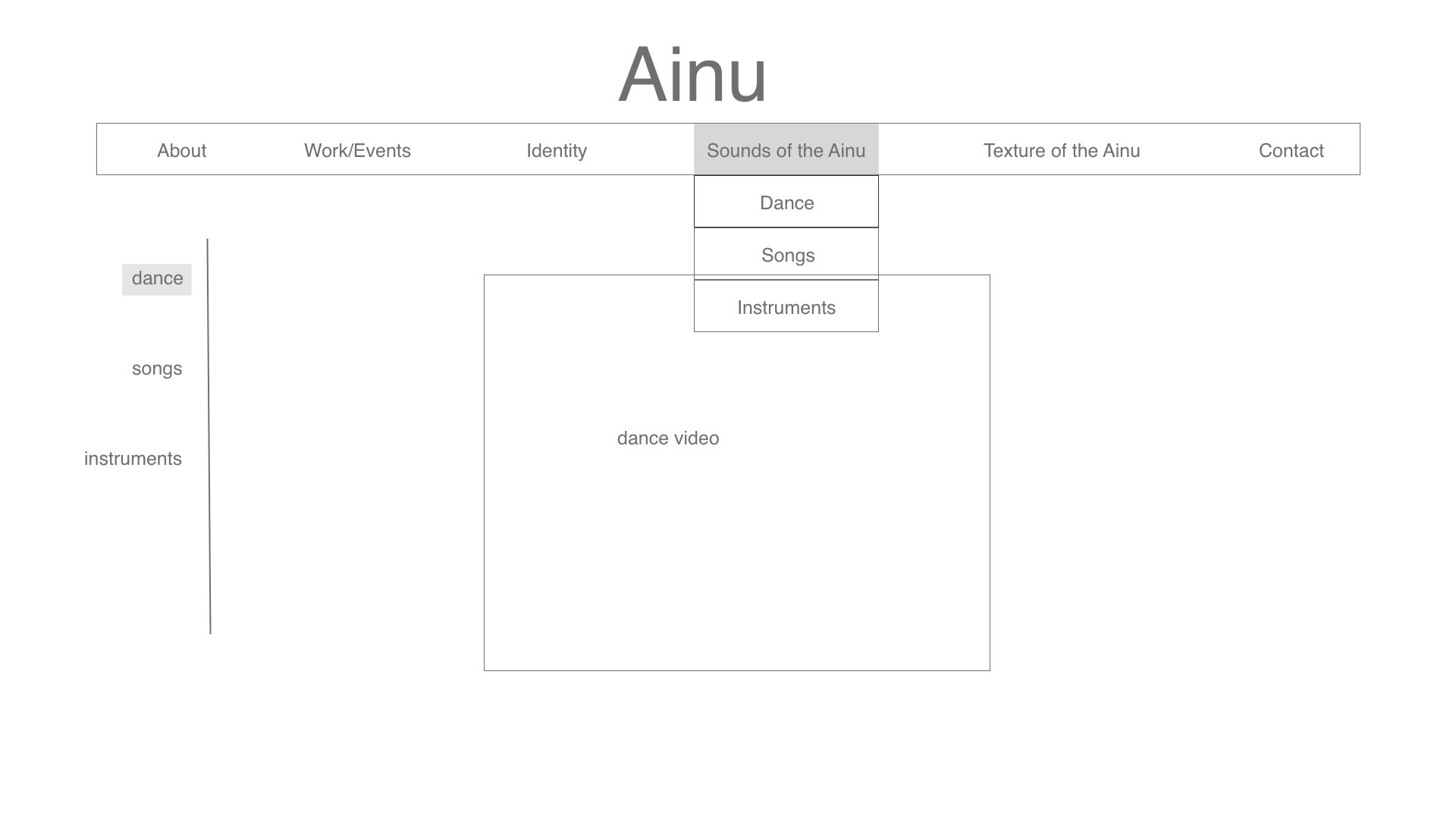
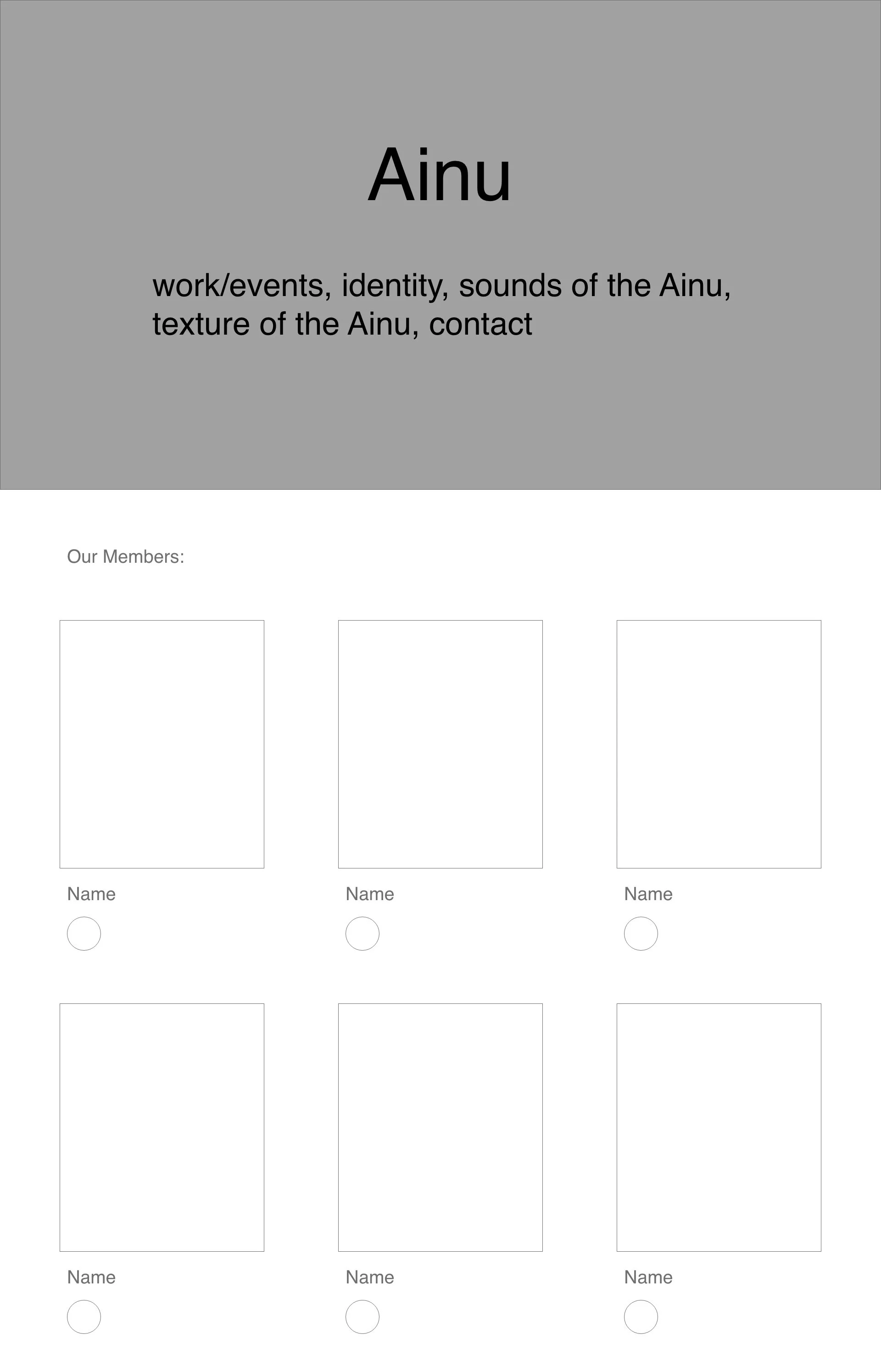
Low-fi Wireframing
drop-down menu
blog page
members introduction page
Prototype
Using the low-fi wireframes as a reference, I chose Wix themes that were similar and created high-fi mockups reflecting those themes. Then I sent the mockups to the client for their take.
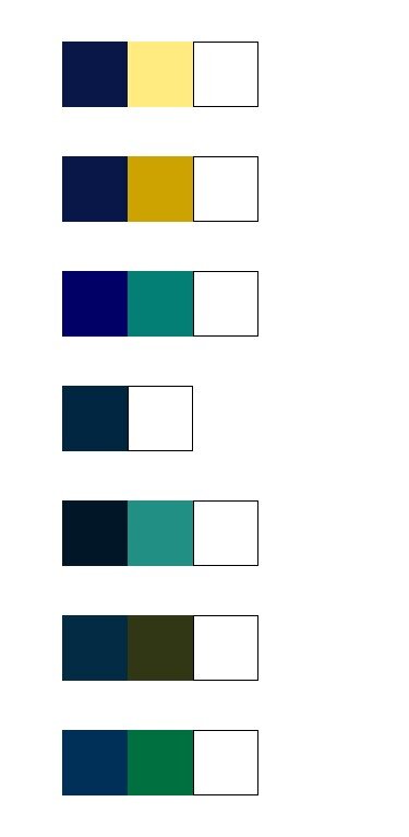
Alongside the Wix mockups, I sent the client compiled color palettes influenced by their apparel visuals.
A mockup of the homepage in the Wix theme and color palette my client chose.
User Testing + Insights
User Test Target Groups
Group A: Internal team
Group B: people who were not familiar with our project or our client
Insights
Overall our users agreed that the menu navigation was too cluttered. Images need a description to give context as to what the user is looking at, and some reconsideration over our word choice for some section tabs.


